USER GUIDE > REPORTS
Table of Contents
REPORTS -TAGS
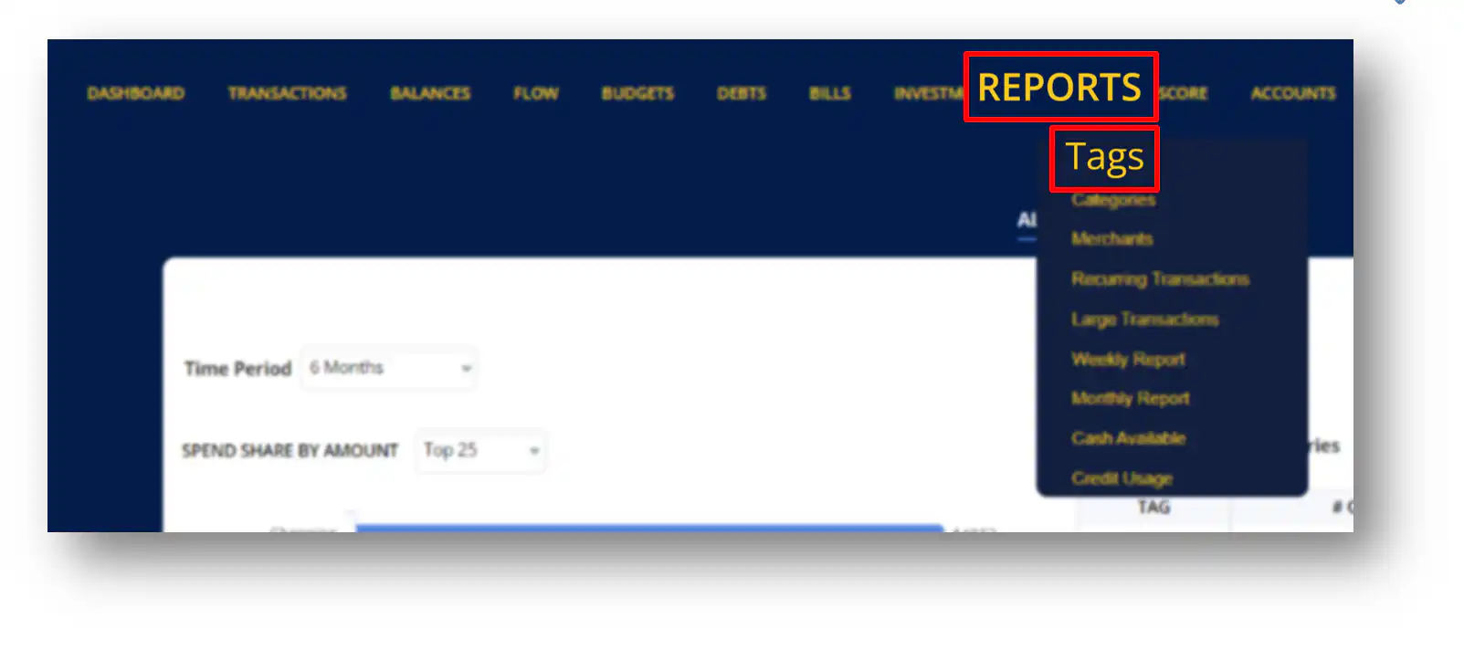
Tags are groups of transactions that you have classified for a specific purpose. To access transaction reports connected with your tags, select “Reports” and a drop down menu will appear. Then click “Tags” to view transaction reports related with your tags.
Tag Reports allows you to keep track of transactions connected with the tags you’ve created. It generates a report detailing how much money you’ve spent on each tag.
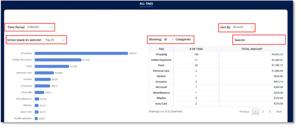
ALL TAGS
BAR GRAPH
Ø Click the drop-down menu beside “Time Period” to filter out the dates of transactions you wish to view on the bar graph.
Ø Click the drop-down menu beside “Spend Share by Amount” to limit the number of Tags you want to be displayed on the bar graph.
TABLE
Ø Click the drop-down menu beside “Sort By” to sort out the transactions on the table based on either the Amount, # of Txns or Tag.
Ø Click the drop-down menu beside “Showing” to select the number of entries you wish to be displayed on the table.
Ø Utilize the search bar to search a specific transaction you wish to view.
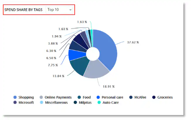
PIE CHART
The pie chart gives you a percentage report of each tags.
Ø Click the drop-down menu beside “Spend Share by Tags” to limit the number of tags you want to be displayed on the pie chart.
REPORTS - CATEGORIES
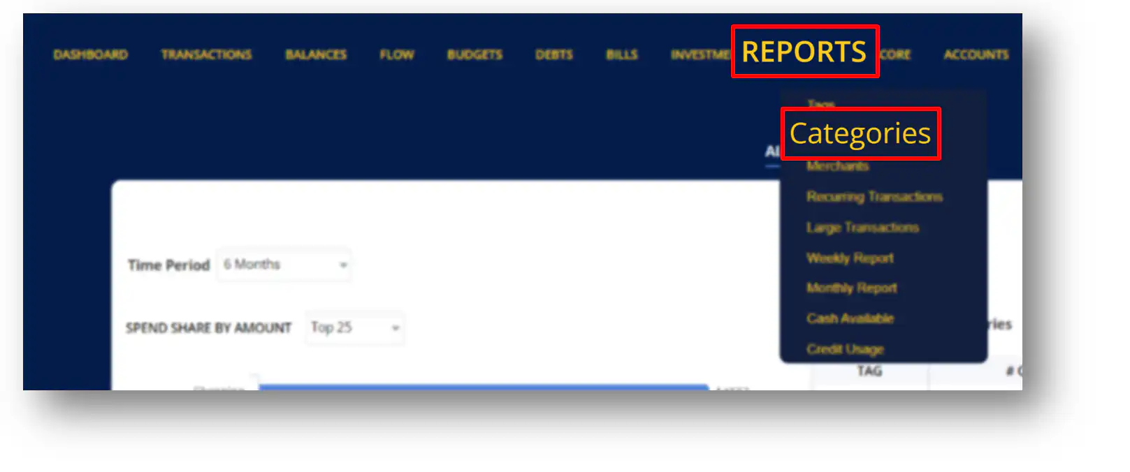
Categories are groups of transactions that you have categorized for a specific purpose. To access transaction reports connected with your categories, select “Reports” and a drop down menu will appear. Then click “Categories” to view transaction reports related with your categories.
Category Reports allows you to keep track of transactions connected with the category you’ve created. It generates a report detailing how much money you’ve spent on each category.
TRANSACTIONS & TRENDS – CATEGORIES
Ø Time Range – This displays the time period you selected that you wish to be displayed on your screen.
Ø Total Categories- This displays the total number of categories you created.
Ø Top Spent- This displays the category with the highest total amount of spent.
Ø Top Transactions – This displays the category with the most number of transactions.
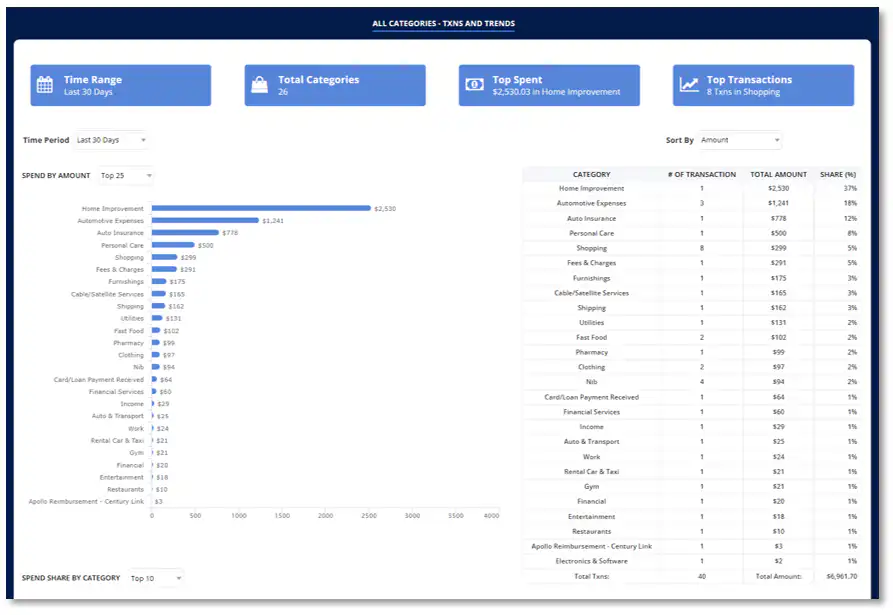
Ø Click the drop down menu beside “Time Period” to filter out the dates of transactions you wish to view on the bar graph.
Ø Click the drop down menu beside “Spend Share by Amount” to limit the number of transactions you want to be displayed on the bar graph.
Ø Click on the blue bar to view all associated transactions with the category you selected.
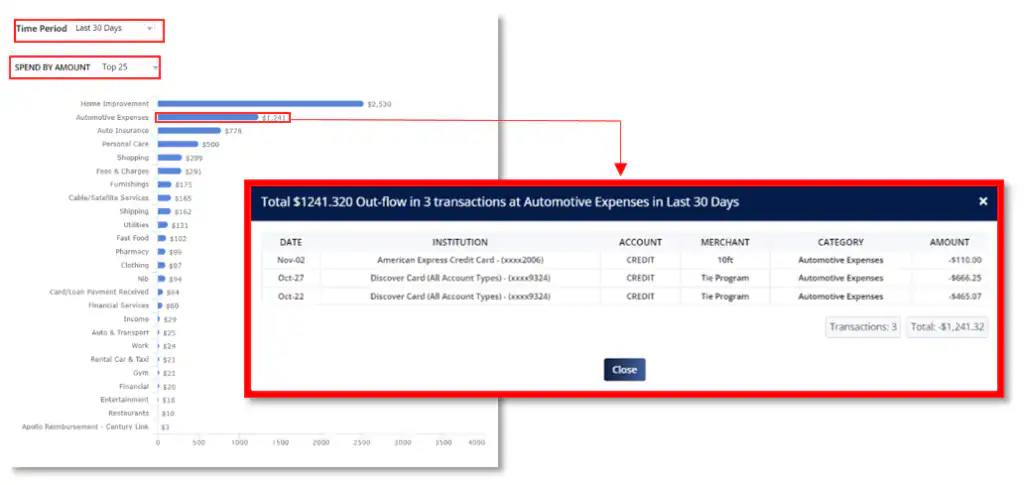
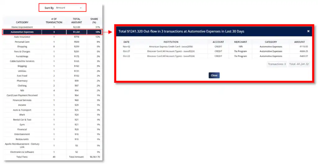
Ø Click the drop down menu beside “Sort By” to sort out the transactions on the table based on either the Amount, # of Txns or Category.
Ø Click on any transactions to view all associated transactions with the category you selected.
PIE CHART
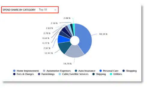
The pie chart gives you a percentage report of each Category.
Ø Click the drop-down menu beside “Spend Share by Category” to limit the number of Categories you want to be displayed on the pie chart.
Ø Click the drop down menu beside “Time Period” to filter out the dates of transactions you wish to view on the table.
Ø Click the drop down menu beside “Showing” to limit the number of transactions you want to be displayed on the table.
Ø Click the drop down menu beside “Sort By” to sort out the transactions on the table based on either the Amount, # of Txns or Category.
Ø Utilize the search bar to search a specific transaction you wish to view.
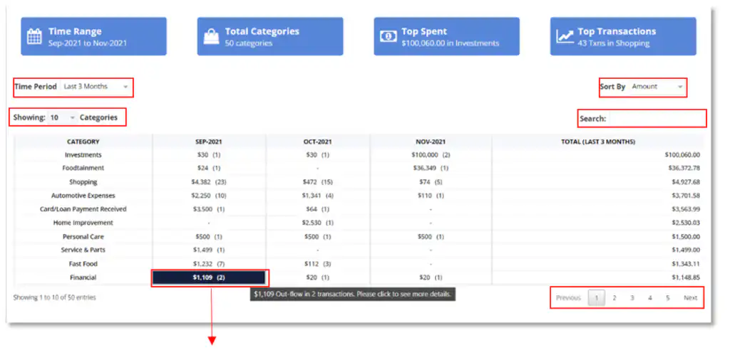

Ø Click on any transactions to view all associated transactions with the category you selected.
REPORTS - MERCHANTS
Merchant Reports generates a report detailing how much money you’ve spent on each Merchants. To access transaction reports connected with your Merchants, select “Reports” and a drop down menu will appear. Then click “Merchants” to view transaction reports related with your Merchants.
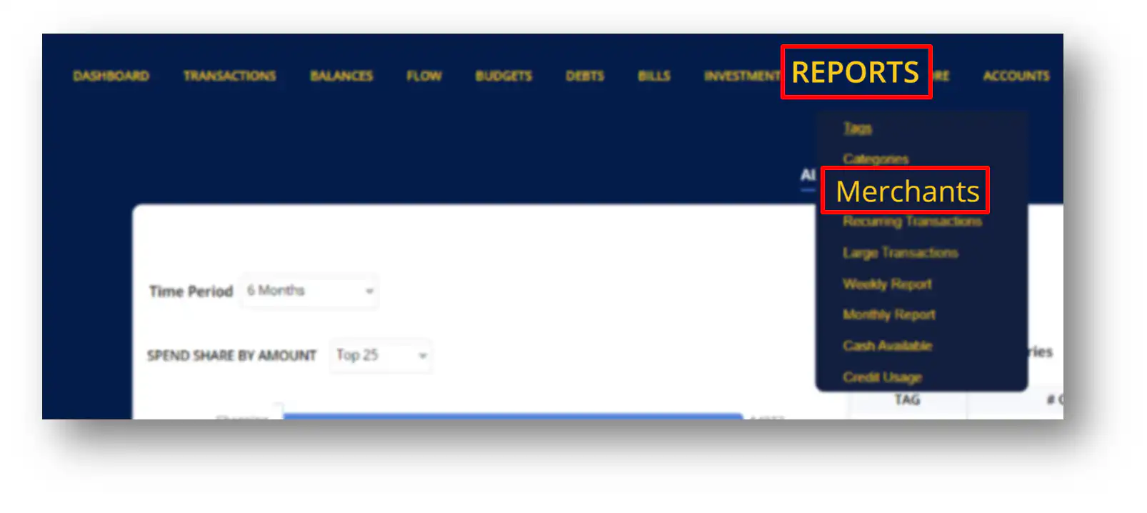
ALL MERCHANTS- TXNS AND TRENDS
BAR GRAPH
Ø Click the drop-down menu beside “Time Period” to filter out the dates of transactions you wish to view on the bar graph.
Ø Click the drop-down menu beside “Spend by Amount” to limit the number of transactions you want to be displayed on the bar graph.
TABLE
Ø Click the drop-down menu beside “Sort By” to sort out the transactions on the table based on either the Amount, # of Txns or Merchant.
Ø Click the drop-down menu beside “Showing” to select the number of entries you wish to be displayed on the table.
Ø Utilize the search bar to search a specific transaction you wish to view.
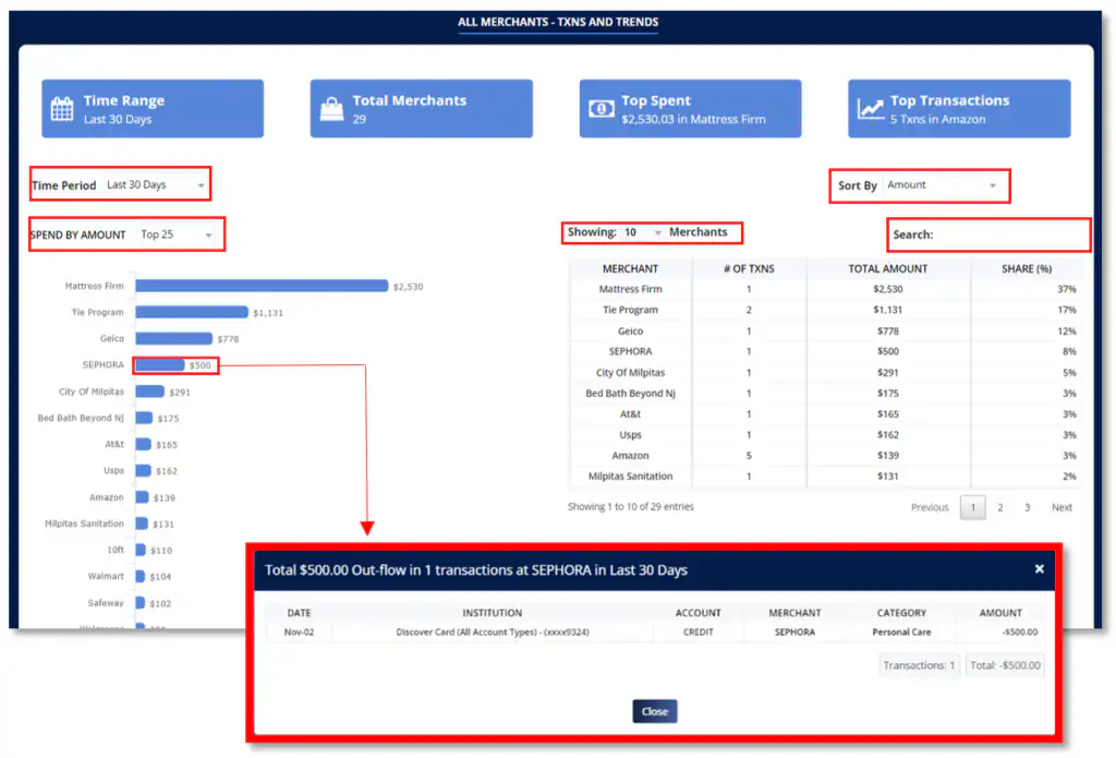
Ø Click on the blue bar to view all transactions associated with the Merchant you selected. A pop-up window will appear displaying the total number of transactions and other details for each transaction.
PIE CHART
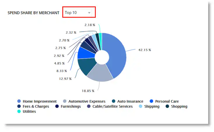
The pie chart gives you a percentage report of each Merchant.
Ø Click the drop-down menu beside “Spend Share by Merchant” to limit the number of Merchants you want to be displayed on the pie chart.
Ø Click the drop-down menu beside “Time Period” to filter out the dates of transactions you wish to view on the table.
Ø Click the drop-down menu beside “Showing” to limit the number of transactions you want to be displayed on the table.
Ø Click the drop-down menu beside “Sort By” to sort out the transactions on the table based on either the Amount, # of Txns or Merchant.
Ø Utilize the search bar to search a specific transaction you wish to view.
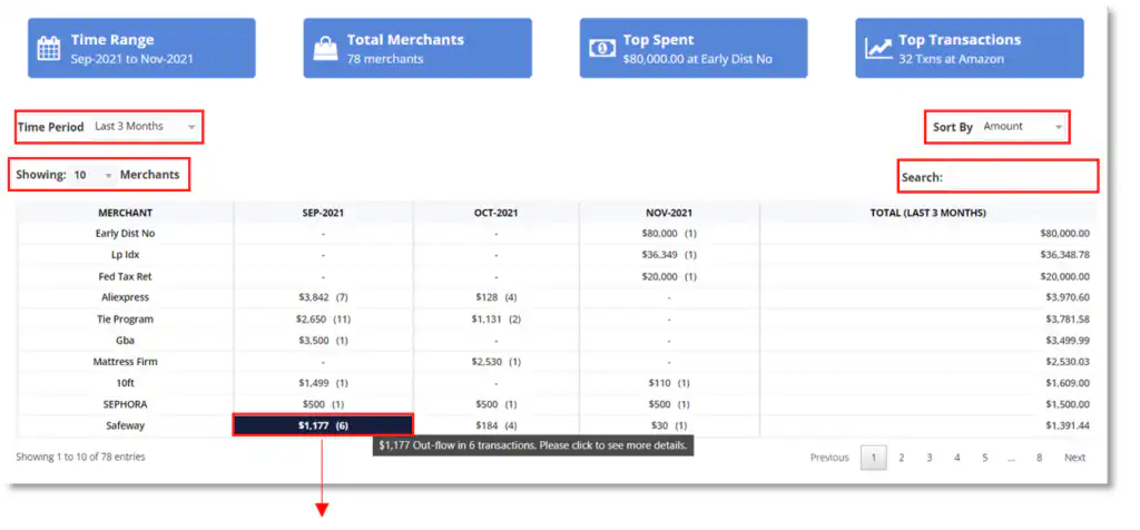
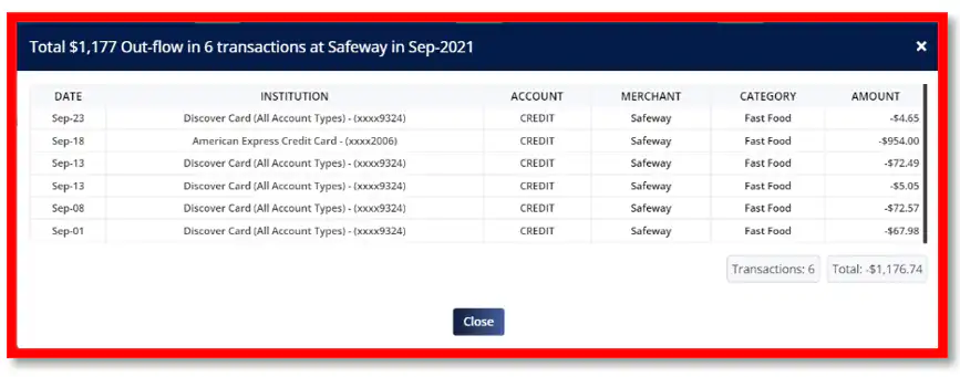
Ø Click on any transactions to view all associated transactions with the category you selected.
REPORTS - RECURRING TRANSACTIONS
Recurring Transactions Reports allows you to view transaction you’ve made periodically. To access transaction reports connected with these Recurring Transactions, select “Reports” and a drop down menu will appear. Then click “Recurring Merchants” to view your transaction reports.
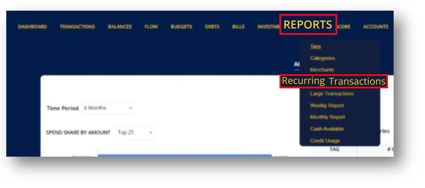
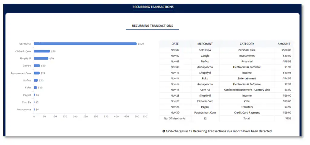
REPEAT MERCHANTS
Ø Click the drop-down menu beside “Time Period” to filter out the dates of transactions you wish to view.
Ø Click the drop-down menu beside “Sort By” to sort out the transactions on the table based on either the Amount, # of Txns or Merchant.
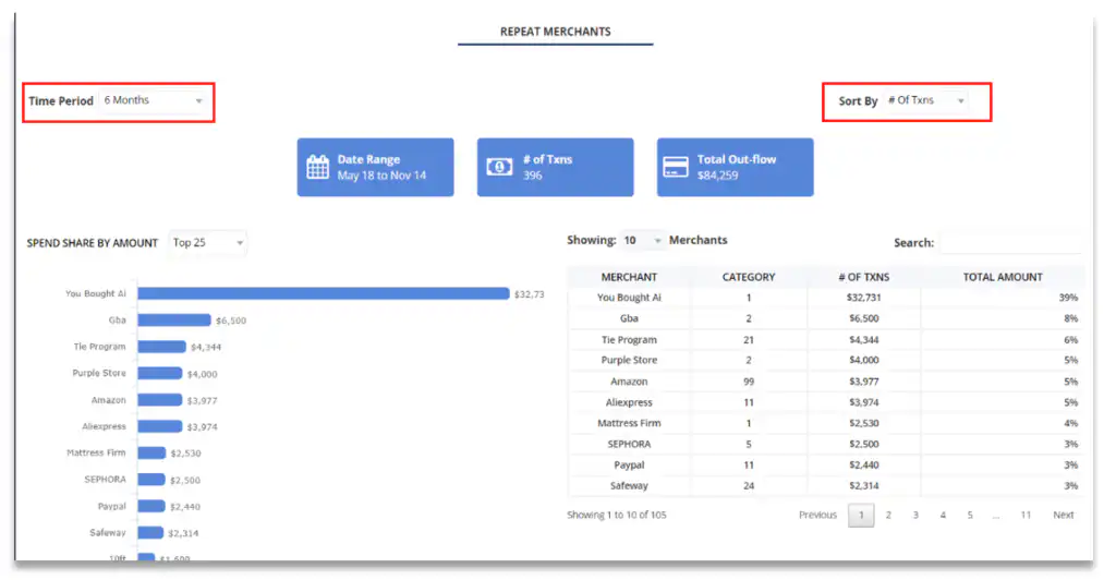
Ø Click the drop-down menu beside “Spend Share by Amount” to limit the number of transactions you want to be displayed on the bar graph.
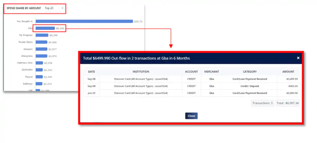
Ø Click on the blue bar to view all transactions associated with the Merchant you selected. A pop-up window will appear displaying the total number of transactions and other details for each transaction.
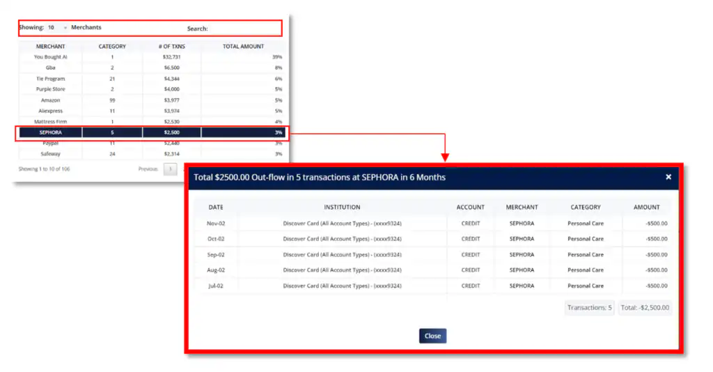
Ø Click the drop down menu beside “Showing” to select the number of entries you wish to be displayed on the table.
Ø Utilize the search bar to search a specific transaction you wish to view.
Ø Click on any transactions to view all associated transactions with the category you selected.
PIE CHART
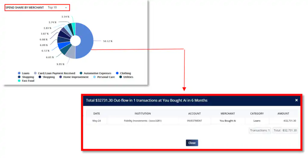
The pie chart gives you a percentage report of each Merchant.
Ø Click the drop-down menu beside “Spend Share by Merchant” to limit the number of transactions you want to be displayed on the pie chart.
Ø Click on each pie and a pop-up window will appear displaying all transactions associated with this merchant.
REPORTS - LARGE TRANSACTIONS
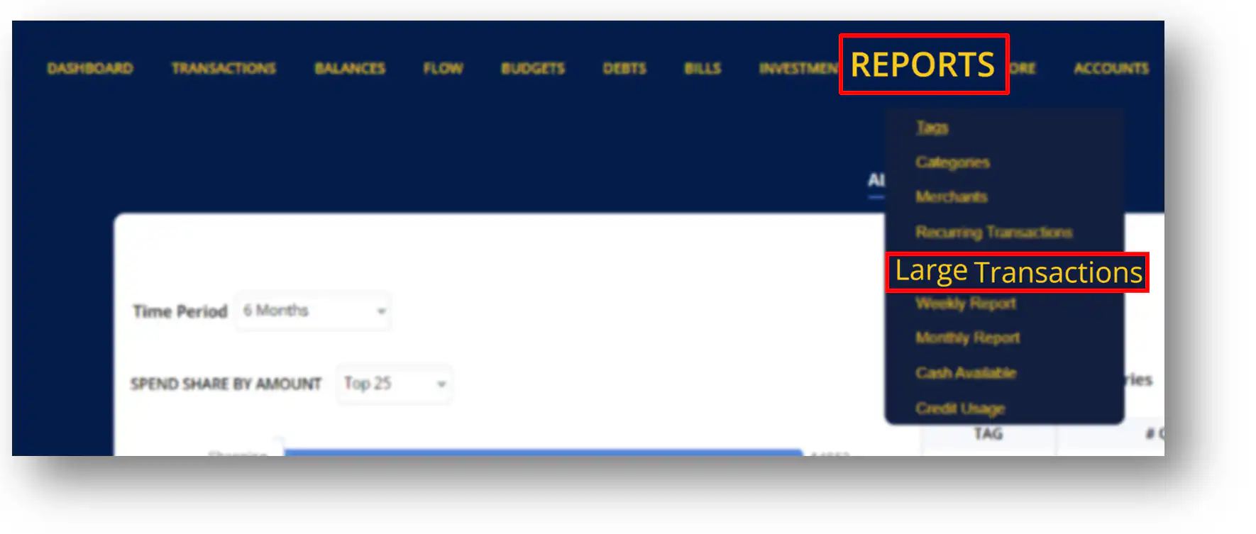
Large Transactions Reports as its name implies, contains a report of large transactions you’ve made on your account. To access this report, select “Reports” and a drop down menu will appear. Then click “Large Transactions” to view your transaction reports.
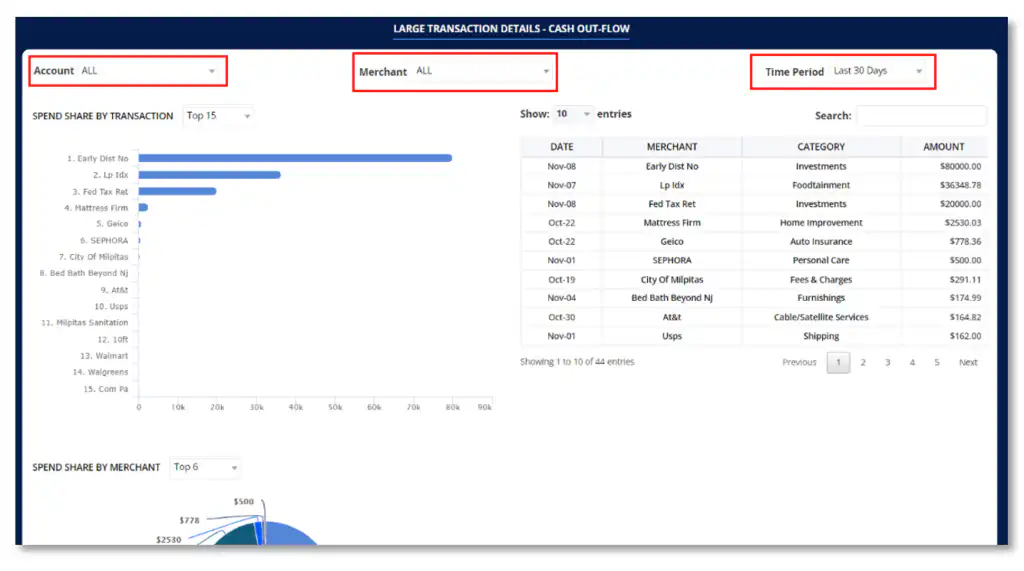
LARGE TRANSACTION DETAILS – CASH OUT-FLOW
Ø Click the drop-down menu beside “Account” to view transactions from a specific institution.
Ø Click the drop-down menu beside “Merchant” to only view transactions from a specific Merchant you selected.
Ø Click the drop-down menu beside “Time Period” to filter out the dates of transactions you wish to be displayed on the screen.
LARGE TRANSACTIONS TABLE REPORT
The table contains reports on large transactions made on your account.
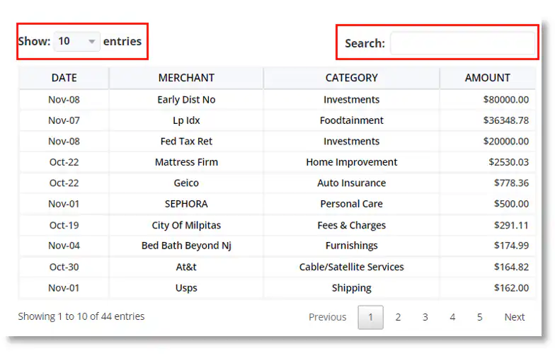
Ø Click the drop down menu beside “Show” to limit the number of transactions you want to be displayed on the table.
Ø Utilize the search bar to search a specific transaction you want to view.
SPEND SHARE BY TRANSACTION
This is a bar graph report on large transactions made on your accounts.
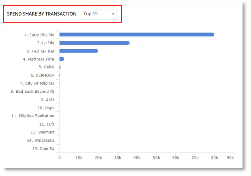
Ø Click the drop down menu beside “Spend Share by Transactions” to limit the number of transactions you want to be displayed on the graph.
SPEND SHARE BY MERCHANT
This is a pie chart report on large transactions carried out by specific Merchants.
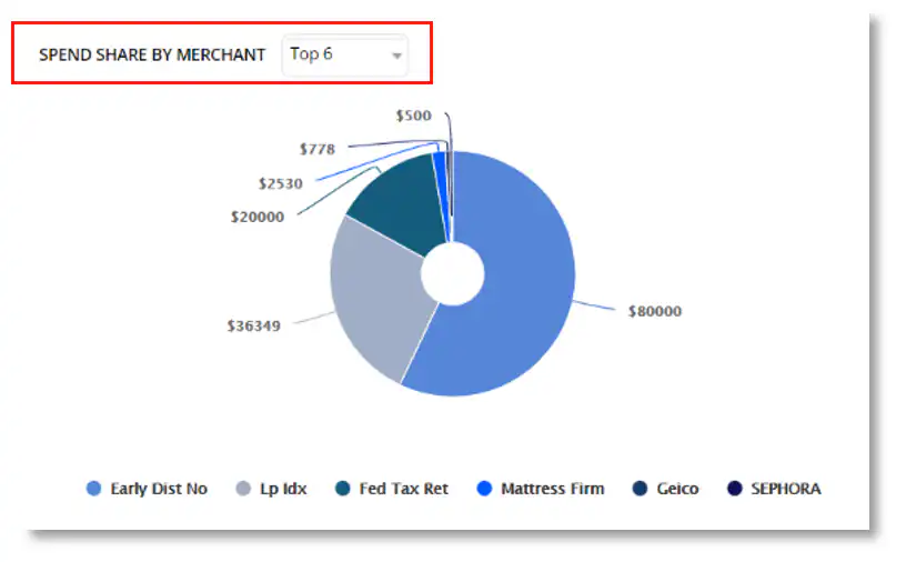
Ø Click the drop down menu beside “Spend Share by Merchants” to limit the number of transactions you want to be displayed on the pie chart.
SPEND SHARE BY CATEGORY
This is a pie chart report on large transactions under specific Categories.
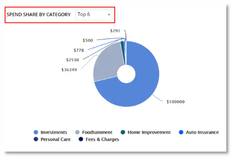
Ø Click the drop-down menu beside “Spend Share by Category” to limit the number of transactions you want to be displayed on the pie chart.
WEEKLY REPORTS
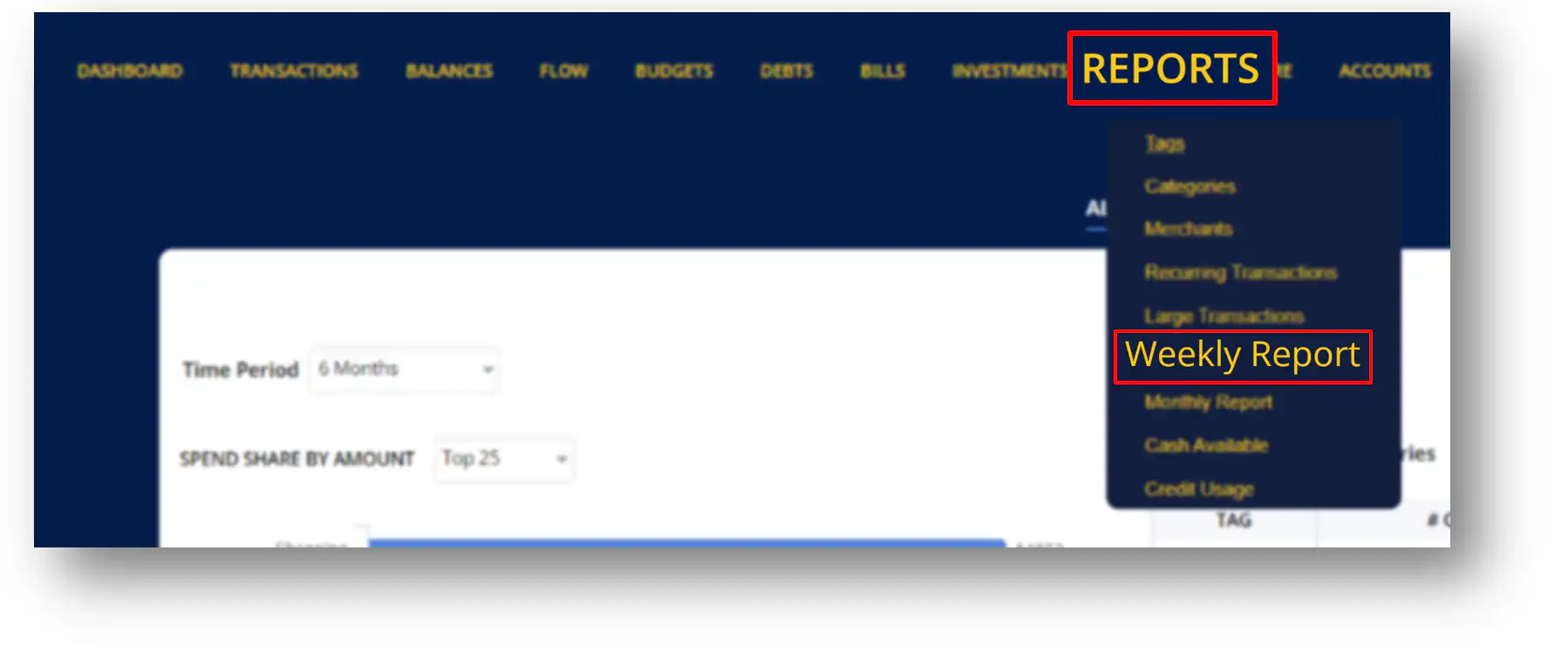
Weekly Reports as the name implies is a report of weekly transactions made on your account. It generates a report detailing how much money you’ve spent on that specific week. To access your weekly report, click “Reports” and select “Weekly Report” from the drop down menu.
WEEKLY OUT-FLOW
The graph allows you to compare the amount spend on weekly basis. It gives you details such as the average spend you made on previous weeks.
Ø Click the drop-down menu beside “Week Out-flow” to select the number of week you want to be displayed on the graph.
Ø Click the blue bar to view the transactions made on the week you selected.

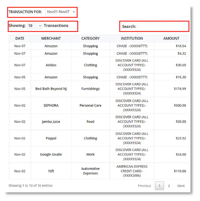
WEEKLY TABLE REPORT
The Table allows you to view more
details on each transaction made each week. It gives you more options in
searching for certain weekly transactions you want to view.
Ø Click the drop-down menu beside “Transaction For” to select a specific week you want
to be displayed on the table.
Ø Click the drop-down menu beside “Showing” to limit the number of transactions you
want to be displayed on the table.
Ø Utilize the search bar you search for specific transaction you want to view on the week
you selected.
MONTHLY REPORTS
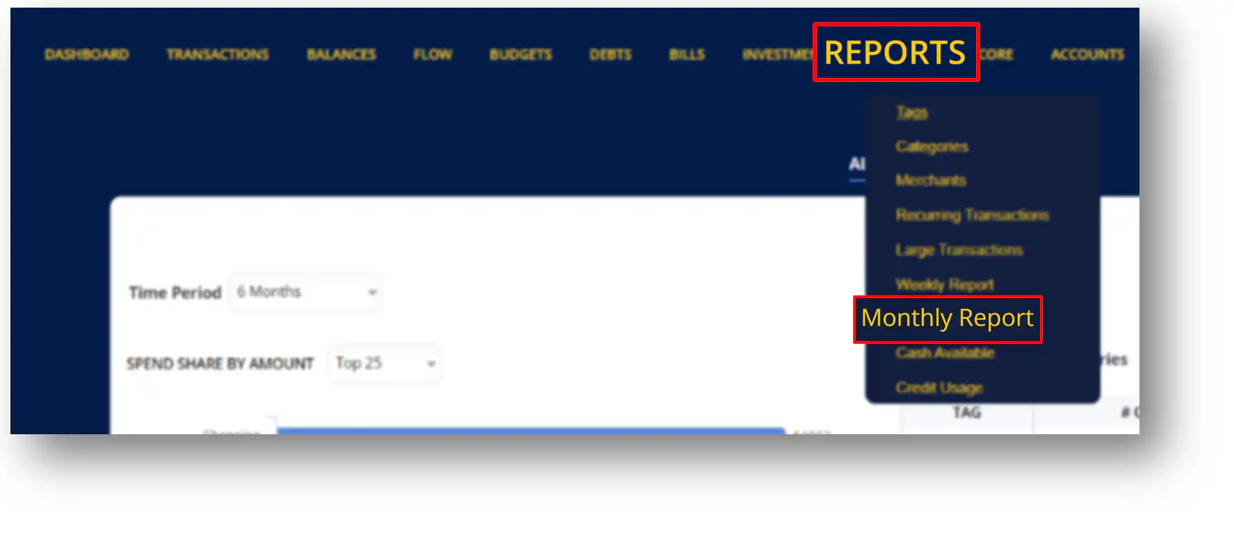
Monthly Reports as the name implies is a report of monthly transactions made on your account. It generates a report detailing how much money you’ve spent on that specific month. To access your monthly report, click “Reports” and select “Monthly Report” from the drop down menu.
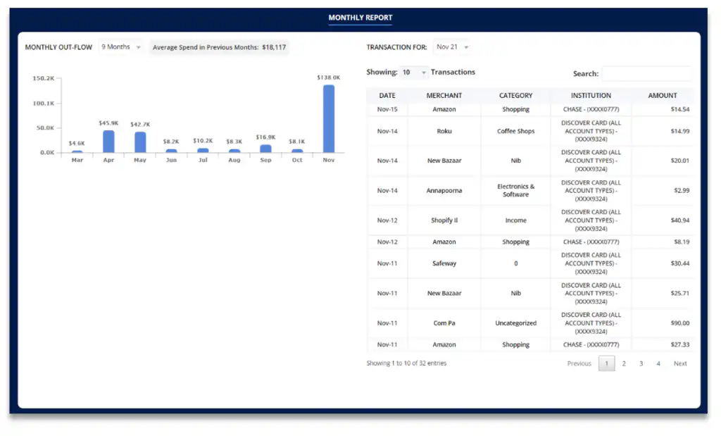
MONTHLY OUT-FLOW
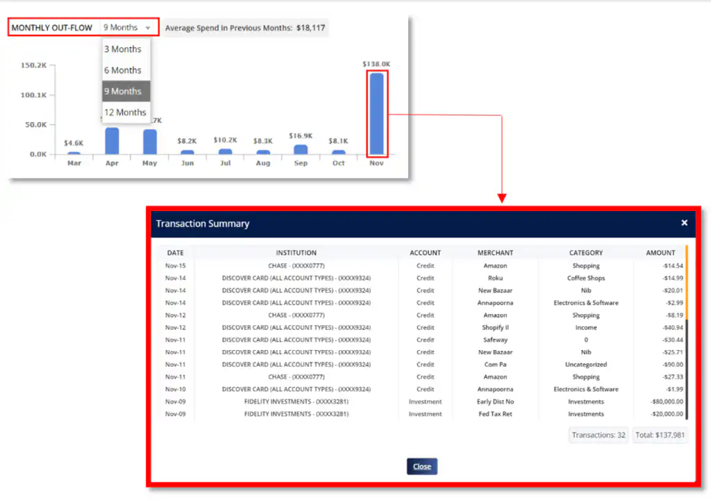
The graph allows you to compare the amount spend on a monthly basis. It gives you details such as the average spend you made on previous months.
Ø Click the drop-down menu beside “Monthly Out-flow” to select the number of months you want to be displayed on the graph.
Ø Click the blue bar to view the transactions made on the month you selected.
MONTHLY TABLE REPORT
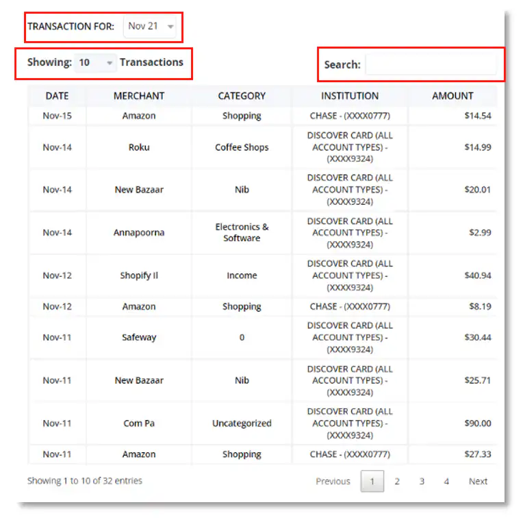
The Table allows you to view more details on each transaction made each month. It gives you more options in searching for certain monthly transactions you want to view.
Ø Click the drop-down menu beside “Transaction For” to select a specific month you want to be displayed on the table.
Ø Click the drop-down menu beside “Showing” to limit the number of transactions you want to be displayed on the table.
Ø Utilize the search bar you search for specific transaction you want to view on the month you selected.
REPORTS- CASH AVAILABLE
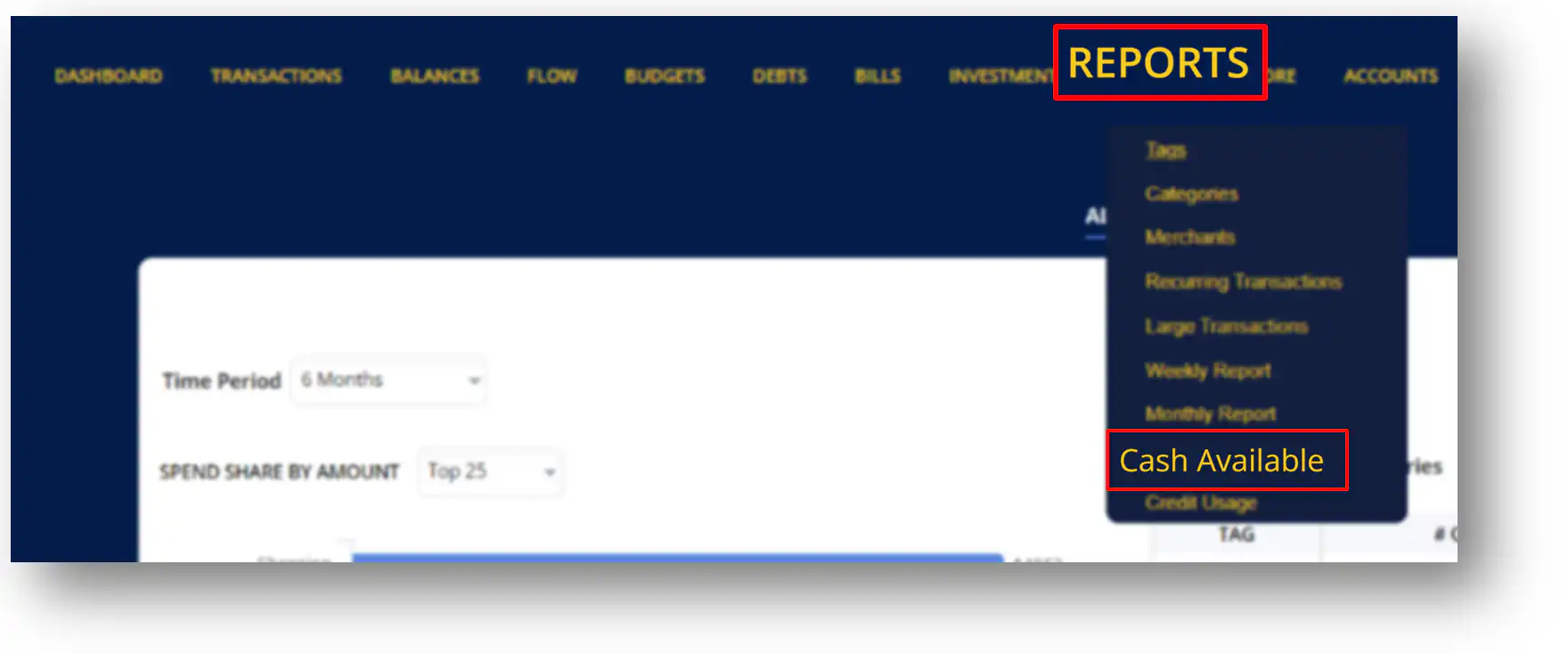
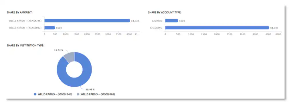
Cash Available Report gives you details on the total amount of money on your accounts that are available for you to use. To access your Cash Available Report, click “Reports” and select “Cash Available” from the drop down menu.
CASH AVAILABLE TRENDS
Ø Click on the drop-down menu beside “Account” to select an institution you want to view.
Ø Click on the drop-down menu beside “Cash Available Trends” to select a time period you
want to view.

Ø Share by Amount- This displays the total cash available for each institution you linked with Money Patrol.
Ø Share by Account Type- This displays the amount of cash available on your Savings and checking Account.
Ø Share by institution Type- This is a percentage report on the cash available for each institution you linked with Money Patrol.
REPORTS - CREDIT USAGE
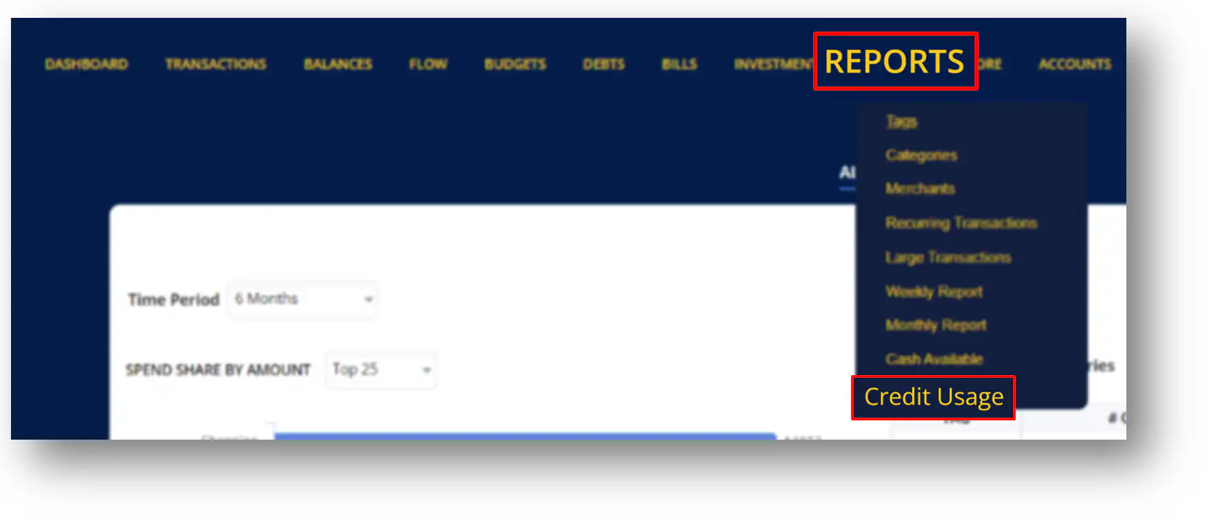
Credit Usage Report gives you details of the percentage of available credit that you use. To access your Credit Usage report, click “Reports” and select “Credit Usage” from the drop down menu.
CREDIT USAGE
Ø Click the drop-down menu beside “Account” to view report from a certain institution.
Ø Click the drop-down menu beside “Credit Usage Trends” to select a time period of reports you want to view.
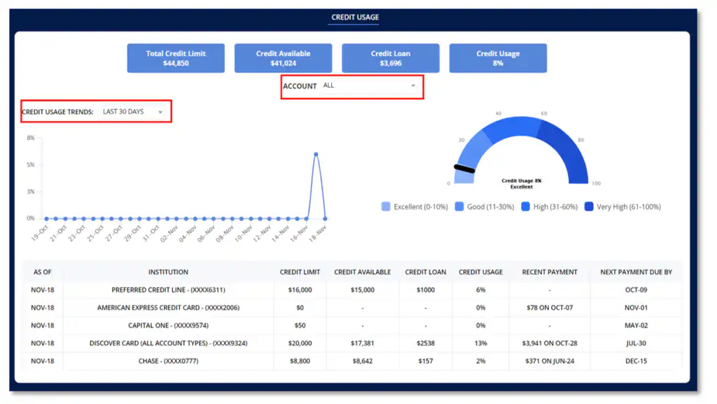
Ø As of – This column shows the current date of the report that is being displayed on the table.
Ø Credit Limit- This column shows maximum amount of credit you can use per institution.
Ø Credit Available- This column shows the remaining credit available that you can use on your accounts.
Ø Credit Loan- This displays the amount of credit you’ve utilized per credit accounts.
Ø Credit Usage- Credit card usage, or the percentage of available credit that you use per institution.
Ø Recent Payment- This shows the amount and date of the most recent payment made per institution.
Ø Next Payment Due by- This shows dates of the next payment dues on your account per institution.
